Recently in Major Metropolitan Art Museums Category

Robert Adams Photographs at DAM

| No TrackBacks
RobertAdams.jpg
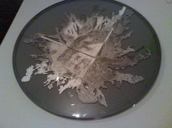
Robert Adams photographs at the Denver Art Museum are the spitting image of ones we've taken as young people exploring rural Colorado and beyond in the '70s and '80s. They are Black and White and make the jarring primary colors of the commercialism of that day look tolerable. And the landscapes beautiful. Like the romanticism of Pete Seeger, 'I am the blue of my sky and the brown of my earth.' And they make the same folksy protest, as well.

We didn't and still don't want to see all the beautiful land in the West to be churned up and spit out as the same old shopping mall. Why not just leave it, and fix the old shopping mall?  Well, because that land looks so easy, just lying there. Adams' photographs prove it.

His photographs of a common farm house on the plains of eastern Colorado looks wonderfully textured in black and white, the wall paper less busy with color and the people richly gray. He didn't make them to be nostalgic. He was just depicting life as it was, and it wasn't that easy. But, with hindsight, we can see that a lot more people were trying to keep that life than managed to do so. There were still a lot of small farms in Colorado, but everything was changing. Farmers only grew what they could sell to big companies. There were no farmers' markets in the city where they could sell anything else. And they had to buy Roundup.

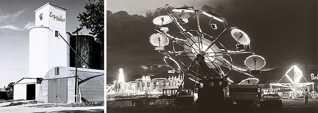
We were, and still are, environmentalists. We wanted then, and still do want, organic food and clean energy.  We environmentalists are the domestic terrorists that exPresident Bush warned everyone about.  We personally may not have advocated burning private property on the Vail Valley ridgeline in the National Forest, as the ELF did when Vail Resorts was building Two Elk Lodge (in memory of the elk that used to be there). I, personally, wouldn't have had the nerve to do it, but I have advocated for less development, especially outside of established ski resorts. There are some who argue that Vail and everything within 25 miles of it, is already ruined. But there are people who thought the new development was the place to draw the line. And they were completely ignored.

Logically, the ski business is flat, so they don't need more property. And Two Elks was the opulent symbol of expansion by a Vail that couldn't be stopped. The frustration of people who see that Two Elks wasn't at all necessary for most Earthlings, is what prompts terrorism. A little arson at midnight, to a half finished building far out in the wilderness where there was no threat to human life or anything but the building - the symbol of wastefulness.  

If you understand this frustration, the feeling of not being heard, you can imagine why an Arab might want to become a terrorist? Can you imagine how hard it would be to be heard in a kingdom where you are a subject and not a citizen?

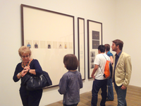
Look at the people calmly viewing Robert Adams photographs and you  will see them smiling. They want that peaceful landscape. Then the scowls -- people are bugged by the lost of citrus orchards in California. Orchards or shopping malls. People do want orchards. There are too many shopping malls between people and their orchards. Because now most of us live in the city.

Change isn't necessarily bad. But are we doing very much to figure out which change is good and which is bad?

Robert Adams photographs might be a place to start.


TateSimonPan.jpgJuly 8, 2011
Tate Modern: Taryn Simon A Living Man Declared Dead and Other Chapters


London2011.jpg
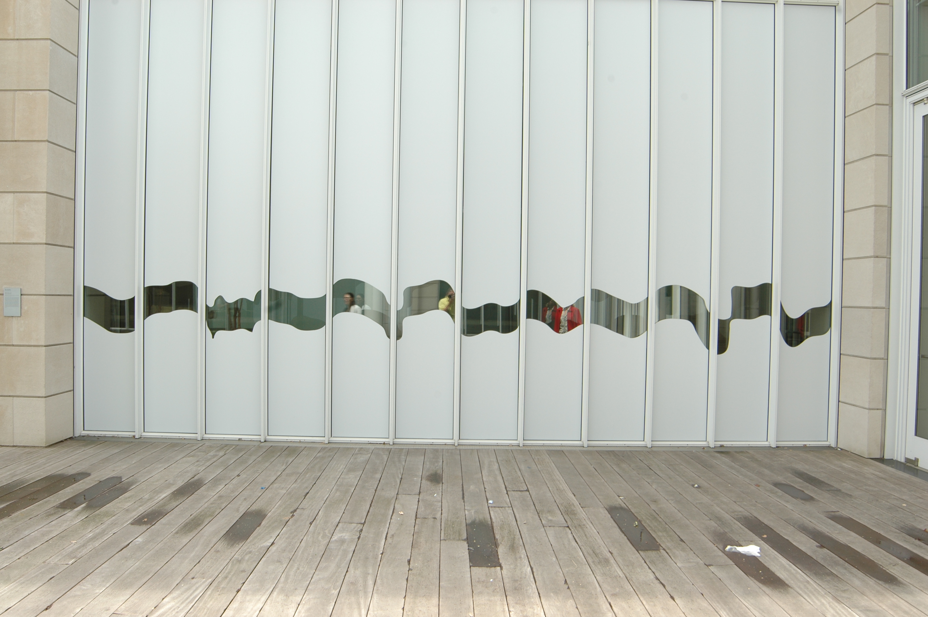
My goal is to pass beyond the guy at the podium and start my trip to England and beyond. 'What's the purpose of your trip?' the guy asks holding my passport. To see art, of course. Instead, I say 'visit family.' I want to slip in, look ordinary like my passport photo on its neutral background.

Inside Britain, inside the Tate Modern, there's a big show of Joan Miro work, but today I look at a living artist, Taryn Simon. In A Living Man Declared Dead and Other Chapters, she shows a series of photo and text assemblages - each with about three parts. One is a grid of passport-like photos, next is text, and third, what the artist calls footnotes.

When the photo is stark enough, like these or a passport, The Identity could be anyone's. One of Simon's subjects is the double for Saddam Hussein's son. Another is a rabbit.

I had to testify, once, before a grand jury. I was handed a page of color photos with the open-ended question: could I identify anyone on this page?  My husband's picture was there and I didn't recognize him until the district attorney pointed him out. The photo was such a bad likeness, and I was surprised to see him on this sheet. He'd sold a truck to a friend, one of the suspected pot growers. I guessed another photo might be a female friend. She was so plain and typical looking in this photo that I wasn't sure. 'Poor pothead, doesn't even know her own people,' I am sure the grand jury was thinking. I was thinking how hard a person is to identify with one photograph.

To truly identify an individual ask to see a facebook page, a library record, my home, or my journal. But, that is not the purpose of passport control. Their job is security; so scan my body for weapons, make sure I am committed to working for a more just and liberal - sorry, liberated - society, and plan to harm no one. What is the artist's job?

Simon_Exhibition.pngSimon's show - in three big galleries - consists of many large, nicely framed grids of photos - images of small heads on a 'non-place' background. They are similar in style, but different from a passport photo in that they are full of one of the necessary ingredients of abstract art: namelessness. Abstract art removed the human so that the image could be universal. The humanlessness of passport photos is why governments want retinal scans and DNA. The artist either doesn't know how humanless these photos are, or we're to feel like they are the universal human.

I read the wall's worth of information about how the grid is like a family tree showing relationships - descendants below antecedents - and then read the details at each piece about some weird political situation that involves these identities - like Saddam's son's double. Or, people whose relatives have declared them dead so they can steal their land.

Conceptually, the project is interesting.  However, the artist has not made the best choices for conveying the information to her audience. Sure anything goes in postmodern art. But, we're at the Tate Modern here, and there needs to be some discrimination. Why?  Because a lot of people will see the work, so it should be effective for the audience - the viewers that will see it.  Otherwise, it's just granddad boring us with pictures he took of his hotel rooms on his bus tour of Germany.

Simon-Audience.png
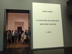
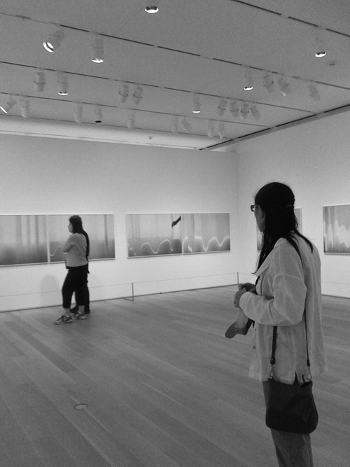
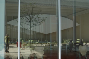
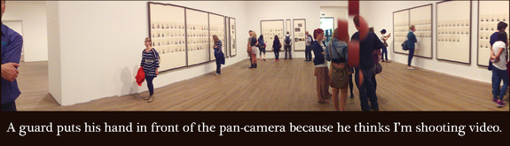
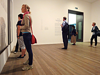
Look at the people in this exhibition. They're myopically reading the walls. Or standing in the center talking. One of our group suggests that Simon make it easier to read the narrative, and give us the time and space to read it - publish a book.  Good idea, but her current audience is, right now, wandering through the Tate Modern. And, it's a big crowd, a less-than-mainstream crowd: people willing and able to look at contemporary visual art.  Give us the visuals.

Could the relationships have been identified graphically? Tiny text at the side giving the name wasn't helpful enough. The 'footnotes' sections are not in giant frames. They're small, filled with documents, some interesting character snapshots, and the meat. Isn't it annoying to read footnotes that are more interesting than the main body of the work?

Yes, there was that big explanation at the beginning of how the project worked, rows related to the rows above and below. We all felt compelled to read that, but then the artist mixed it up, and it wasn't the key to work out the relationships after all.  Obviously relationship is important. If there were no pictures the person was dead. I read it. I could go and do more reading, youTube searching, and see if I could understand it.

I did watch the video, and the artist is a lovely young woman. She spent four years traveling around the world, and the relationships she says she's trying to present are those of chance, blood or other elements of fate. Nowhere in the show, but on the video she says, people are each just one in a long string of births and deaths all with stories attached, and they keep coming (hopefully).

But we didn't get to meet these people on a trip around the world, and we need more to feel or understand it - otherwise this is just a big waste of time, effort and money, which is why people hate contemporary art.  It feels like the artist is doing this for herself. Self expression: well then, you can just keep it to yourself.

Simon-Watch-Woman.pngThe weak photographs - even as wallpaper - draw our attention because of the size of the frames. We look, we try to understand, but unfortunately there isn't enough visually in front of us to engage us further and enable us to really see something more than just the narrative summary she gives us.

Maybe this show is an example of how bad journalism is nowadays. The only story that I could read to the end was about Sadaam's son's double, and yeah, I know, it's coming out as a movie soon.  It's a tabloid kind of story, and the lives of ordinary people usually aren't, even if they are doing very interesting things. Like trying to make art about the relationships of unique ordinary people.


PeepMilleniumPark.jpgWhen I walk into a Gothic cathedral I get what its creators hoped would be the original Shock & Awe Treatment. The containing of this much space exudes power. Commands some awe. Worship in the right souls, if not mine.

The modern wing of the Art Institute of Chicago is one more building in the new shockwave of awe inspiring architecture. Its volume made this institution the second largest art museum in the U.S when it was completed in 2009.  It was time we became another couple of its art tourists.

We walked up a long ramp from the botanic gardens in Grant Park and landed on the top floor in front of the rooftop restaurant.  Saw the new installation out on the high patio which was the subject of an editorial in the Chicago Tribune on Sunday - and noticed that it did indeed block the view to downtown, but gives a peephole to Millennium Park. After stepping off the vinyl of the patio floor, we descended by escalator between walls of glass to the first floor and into the expanse of the new glass and white metal building designed by Renzo Piano.

Modern-Wing-AI.JPGThen a fortunate thing happened. Right in front of us was the show I wanted to see: contemporary photographs by Uta Barth. Knowing now how much there is to see in this enormous wing, without even contemplating the impressive Impressionist stuff that's in the old building, I would have been challenged to give full attention to this small, two-room show.

Instead it became my grand entry to this amazing space - a beautifully sparse beginning worthy of a Coen Brothers movie. Barth's work is ethereal. Drawings without any lines.

They are photographs, and are essentially scenes. Interiors. An out of focus table, soft shadows of a glass and pitcher, or maybe a bottle. Not the things just the shadows of them.  A fragment of an arm and a hand's shadow.

The first objects I saw were a pair of 'couch sized' photos. No frames just the image mounted on a sturdy piece of white Plexiglas   - the hardware, the physical disappeared. The next images included little tangible stuff, little more than a simple orb of a ceiling lamp. The top edge of a couch made its way into the frame, too, but the real focus was shadow and light.

What do you think of these? I asked the guard, who let me know she'd had some time to look at them. 'I don't get it at all,' she said. They're just shadows. Maybe, somebody's house. Somebody who likes the way they decorated their house.'

barth.jpg'I think you had it right the first time,' I said. 'If somebody cared about the decoration, we'd see more of it. I think it's about how beautiful the shadows are. How they fall on the wall and what shapes and tones they make.'

I've seen light do this kind of thing before - been inside small spaces where shadows piled up on each other - and I thank the artist for reminding me to look.

Then I asked my friend what she thought. She felt like the artist was ripping off the craftsperson who designed the lamp.

We went into the next room and the photos were even more abstract - just curving lines of white on a undulating gray field. The gray was a textured curtain draping in waves like the folds of cloth on the characters in classical painting. The flow of white was a cast of bright light repeating this curling wave is a graphical way. Just a natural incident of light, somewhat manipulated by the artist playing with the curtain.  

Yes, she manipulated the curtain, she admitted on the curatorial card. And this is not normal for Barth, the info continued. She didn't modify the photographs, just helped the light fall in a beautiful way. So it's not naturally occurring shadows and light. Artist modified light, instead. I've heard many artists talk about their work with more evasion than a politician. This is the epitome of transparency. 

Uta_Barth_Ext_Art_Institute.JPGThere was another little space behind the wall where the photographs hung, and catalogs of  Bath's work were laid out on a white table with a single chair available to readers. The big windows to the courtyard were covered with white vinyl film with a little wave cut out so you could see outside. 'Wouldn't it have been nice with a curtain? my friend said. 'Instead of plastic.'

Thumbnail image for Art-Institute-Modern-Wing.JPGIt would have been so easy to ignore the subtle images Barth photographs, but seeing them made it easier for us to sense the enormous gulf between cloth and vinyl. We'd been given a little boost of Day Vision.

And then, we went back through the show, past the guard and she stopped me, 'Those shadows on the lamp are really interesting.. I've been wondering .., 'why'd that light land on the wall like that?' We talked about shadows a little more and went out into the courtyard where light was bouncing around like a crazy person.

I neglected to ask the guard what she considers her life work, but my friend, a lawyer by education, makes mosaics, and I write about the experience of looking at contemporary art.


A pool of water : Video Art

| No TrackBacks
Blink at DAM and it's gone

April 29, 2011

Six weeks is not long enough. Blink is a show at the Denver Art Museum that will close in three days. No street banners advertised Blink just a little sandwich board outside the museum and I've been wanting to get to the museum since the show opened March 13. Finally, I get to the museum today, and I need more time.

To visit this video - or as the Denver Art Museum wants to call it Time-Based Media - exhibition with your mother, your brother-in-law, an aunt and some kids is also the wrong way to go.

We all enter the second floor museum space and it feels like a dark arcade of at least 40 video games. The room feels good sized when it a painting show is inside, but with the asymmetrical and weirdly-angled walls dictated by the new-age architecture of the building, it is too small and too occupied by too many things speaking at once.

We are not able to multi-task no matter what our age. Brain scientists is fairly certain of this. A good multi-tasker is someone who is better at turning off and on focus quicker than others. They still concentrate on just one thing at a time.

If this show is about time, then we need to have a little of it to look at each work of art in this exhibition, particularly because we have to overcome the arcade effect. At first, one can't decide which game to play, so we dash around the room and see what 'catches our eye.'

In my dash, there were several works from the DAM's permanent collection that I recognized. I could skip those. And one piece was up in a closet-like space and was a one-liner: look that video is pretending to be something coming through the ceiling.

On my second pass through the gallery, I saw a B&W film of a cupped hand holding a pool of water. The last time I'd passed by I was sure it was just an abstraction of someone's hand. And then I watched as the water drained from the cupped hand. And I kept watching and I saw the abstraction I'd seen before. 'What is this I?' asked one of the kids.

'A blurry picture of somebody's hand.'

'What are they doing?' I asked.  'Don't know,' was the answer.

Then, the video faded to black and looped to the beginning with the hand full of water. The reflection on the water was a man's face - the artist holding the water - and as the pool became smaller and smaller, the face became more and more abstract, blurring the details on the palm of his hand. The face was so unrecognizable that it wasn't until I saw the whole piece that I could recognize it in the middle.

This is how I spent my trip to the 40-plus video exhibition Blink discovering the work of Oscar Muñoz, the artist watching water leave the palm of his hand.

.....................................................................
Oscar Muñoz is a Colombian artist, and a still photo of this piece can be found by following the link. Nto be confused with the Texan, comic magician who works with school kids.

If you like thinking about his work, see my Art Tourists entry about Dissolve, the 2010 SITE Santa Fe biennial.


Damn nice drawings at the DAM

| No TrackBacks
MB_panorama.jpg
Marc Brandenburg
Dec 2010 to Feb. 20, 2011

Thumbnail image for MB_man.jpg

MB_vomit.jpg Drawings of a photographic negative done with a great amount of skill and sensitivity to the beauty of graphite laid down on paper. This describes the drawings done by Berlin artist Marc Brandenburg, which are currently on show on the 3rd floor of the Hamilton building of the Denver Art Museum. and will remain on view until February 20, 2011.

We can recognize the imagery although it is a negative - everything that would be white is black and vise-versa - of people or landscapes.

Mostly people. Realistically drawn people I found interesting to look at because of the skill of the drawing, but I didn't feel like a voyeur because they were the negative. Oddly, I felt like I had permission to stare, and not feel I was staring at a human.

Another twist, and probably a benefit, of the negative is that the image of pop singer, Michael Jackson, was very black because he was so light. Some figures were blacker, and must have been whiter in real life.

The drawing of a naked man (photo at right) was cut out of the page and floating in a shadowbox with a black background. Likewise, the drawing of vomit was cut out and lying on a pedestal. A couple of kids came into the space and really liked the drawing. Then their parents read the title -- Vomit -- and everyone said, oooohh, yuck.

Even when the drawings retained the rectangular shape of their paper, they were floating in the frames. Sometimes the paper curled a little and felt like snapshots.

Especially the first one, above. It was long and made up of a series of pieces of paper, not just one page.

The subject of this long drawing was a protest march. The words on the banners were in German and backwards, so it's meaning was insignificant. I could concentrate on the images. The series made a complete 360 degree view of the scene, laid out like a panorama. The series started with people beside the viewer, then people in front , on the other side and back around to the people behind.

The negative rather than positive images made me feel weirdly distance from the scene, but warmly attracted to it because of the soft beauty of the pencil on paper forming shadows and modeling the forms to make them feel round and alive. Drawing is an intimate medium. Really feels like something made by hand.

And being made by hand, the shadows and textures are often done in different ways. And then there are the whites - the untouched paper. I had to remember that they would be black - the blackest black. And my imagination is probably better at making this kind of black than a pencil is at making true, true black. My companion complained that it was boring to have to keep translating these from negative to positive, but as you've read, I kept thinking of reasons why it worked.

Relevant Landscapes

| 1 Comment | No TrackBacks
Pickering-Landmine400.jpgLand in Art at the New Mexico Museum of Art

October 27, 2009

SANTA FE, NEW MEXICO - On day three in New Mexico, I find it's time to differentiate myself as an art tourist, one who travels to see contemporary art, from tourist art. Art made for tourists including the art made to hang on walls is beginning to wear me down, although I consciously avoid looking at bad galleries. However, just walking around Santa Fe my companion has already managed to call some paitings we've walked by 'insipidly lifeless'. The gallery called it Nouveau Surrealism, but the images were like a Doonesbury comic strip, my companion continued until he realized he was insulting the a comic strip. Nauseating, was his conclusion, in the first ever use he has made of that word. Style without substance.


In a few days we'd already seen lots of attempts to recreate, to emote, to aesthetically communicate the beautiful land around us. It's a hard job in a visually clutter world. Georgia O'Keefe's sensuous works usually do it for me, but here in Santa Fe, they are flaunted everywhere amidst the nauseating stuff. And all the copiers of O'Keefe, of dead Impressionists, of dead Abstract Expressionists, of Western Artists like Remington and Russell and of all the copiers of Indian artists.


Realism is boring, O'Keefe said, what's interesting is what an artist emphasizes, points out to you.


New Mexico was the home of a land art collective show this summer, and we'd missed most of it by this fall trip, but went inside the Fine Art Museum of New Mexico to see a more traditionally placed exhibition on the land idea.


The show was based on an old photo show at the George Eastman House, called New Topographics, something about: in today's world what does man do to the land, how does man live in it that makes land relevant to us human folk today. The show is called: ManMade: Notions of Landscape.


Well, it sustains us, said my companion. We are of the earth, not really of the city structure although so many artists today feel city is their environment. Cityscapes are veiled, I think. And we Westerners are lucky to still see the unveiled thing, and feel something about it.


Last night we were in Ojo Caliente, soaking in hot water that people here have been soaking in for centuries (longer than people were saying USA) and when we get out, we and everyone around us, were wearing the same robes like in a sci fi movie set in the future.


About the show: ManMade: it is mostly photography. And a reenactment of a Robert Smithson, . Without that piece, called Atlantis, there was nothing physical about land included in this show. All were snaps of it. Artificial 2-Ds of landscapes, just as Smithson's is a make-believe landscape.


A museum guards told us they brought in 4 tons of glass and broke it in the gallery - wearing safety glasses and respirators. He also observed a couple, in their twenties, who had no idea what Atlantis was.  They, he said, were going to go to Africa and visit it someday.


Sarah Pickering - landscapes of England - pastoral countryside. Photographs of explosions of a land mine, a fuel explosion and artillery. Looking at her pieces you could actually focus on the landscape, see the trees with the various explosions.


An-My Le was included with a good B&W photo of rockets; some accidental images are better than others and just because Famous-Artist makes them doesn't make them beautiful or even interesting. A little curatorial integrity would have been appreciated. I'm feeling skeptically sarcastic as I ask: Is violence necessary to be relevant today? And is it okay to intersperse images of landscape?


Smithson's piece was particularly violent. I imagined impaling myself on it, throwing myself on it, and it was frightening, a better rush of chill than any viewing of horror film or homicidal newscast.


Horn-StillWater450.jpg

Roni Horn is included with a series of photos of the Thames River. Pretty images. Horn concentrated interest because there were 20 or 39 footnotes on each one, but in this relevant age, we ignore footnotes. How many of us want to know what's in the footnote? And I am bothered by the paper curling and the quality of the print being so poor. If it's about water close ups being pretty, then make them pretty, bad craftsmanship should have a point.


Tuning in to the Psychedelic

| No TrackBacks
DENVER - I'm laughing, walking through Psychedelic Experience that opened March 21 and runs through July 21, 2009 at the Denver Art Museum. Here were posters, essentially ads, for all the sneaky, rebellious stuff we used to do hanging in the Denver Art Museum. And me too. Hanging out in the Art Museum. The current show in the big temporary, contemporary gallery of the DAM is the work of guys making posters for Bill Graham, concert promoter for the Grateful Dead, Santana and others.

I'd just bought a ticket from a young woman who wouldn't credit her parents for being full hippies. I wondered what gave a person real cred in that realm. Dropping acid, making art, doing the light show at concerts, making music, stealing cool images and making posters, bra burning, protesting, just having long hair?

The last time I was in this big gallery in the new Hamilton Addition to the museum - where you feel like you're inside an origami crane - the show was German painter Daniel Richter. His big paintings of organically amorphous figures and dangerous, graffiti-covered unreal places trying to be edgy pushed me away from the walls. Standing back I like the feeling I had that someone was standing in each one of them, and yelling at me, slurring.

My criticism of the Richter paintings -- busy and bright and reminding me of the shameless advertising of the psychedelic posters that I spent so much of my youth staring at while listening to the Grateful Dead, et al.

So today, I'm being drawn to those same folded-walls looking at posters from 1965 to 1971 from San Francisco. I laugh and think about someone writing a saying on the wall that says - there was a secret, cryptic language on the posters that told you there was going to be acid in the Kool-Aid.

Did old acid trips flash back to me at that moment? No, but my companion did remind me how light shows were made, and later we were able to go into an adjacent gallery and make a light show with a clear dish, colored water and oil and an opaque projector. I guess I can always still hear the music that went with those trips. But what I started seeing in my mind's eye was the equipment I used to use at art school - the Rapidograph for drawing and making new typography. Or rubbing Lettraset on a layout board. Taking that scrubbed white board with the little blue layout lines to the camera to make the negative for the printing press and then later the smell of real ink.

Then my companion and I really got to the issue of the day. The price of concerts was $2 to $4. The price of a car has ten times since 1971 --- how about the price of a concert?  I wouldn't pay to see Sting because it was more than $100. Twenty-five to 50 times the price of a concert Bill Graham was advertising. The price of graphic design? Has it doubled since 1971. These artists were paid $100 per poster. Would you pay $1000 today, or would you ask a high school kid, or a friend of a friend to design it, or hold a competition and give the winner 50 bucks? And where are the really cool posters today?  We compared a ticket from a concert in this exhibition with the one that had been printed for us to enter this show. Boring. No wonder kids are slopping spray paint everywhere. There's no place for real graphic design. The DAM tickets are the same as the ones that were printed when the new wing of the museum opened. Whatever happened to the Handmade Revolution we started back in the day? I think it went away like Women's Liberation, and Free Love.

Terry Talty is the Art Tourist who lives the Psychedelic Experience .


Rotho Meditations at Tate Modern

| No TrackBacks
rothko1.jpgrothko2.jpgJan. 29, 2009

LONDON  - In the early 1950s, Mark Rothko started making paintings that nearly everyone today could identify as a "Rothko." There were large paintings, usually two (sometimes more) rectangles of color on a colored background. Sensuous, almost cloud-like color shapes floating ethereally on equally sensual backgrounds. Because they have no recognizable images, when you look at them you feel only pure emotion. That was the radical idea that came in with the whole movement called Abstract Expressionism.

By 1956 or so, Rothko and other Abstract Expressionists had been on the cover of Life Magazine, were selling well in New York galleries and making money. At this time, Rothko was asked to paint a dozen canvases to decorate the soon-to-opened Four Seasons Restaurant in the Seagram Building, in New York City.

For this commission, instead of the multi-toned palette of his previous works, Rothko limited himself to a very small number of colors: red violet, orange and a dark red. The works were never installed in the restaurant. Rothko is quoted as having said he wanted to make the rich bastards who ate there nauseous, then of saying he designed these to be placed very close to the diners, then finally, refusing to sell the paintings to the restaurant at all because the place was just too inappropriate for his work.  At the Tate exhibition, these dozen paintings fill an enormous, dimly-lit room with their emotional presence. The low lighting is to protect the paint that turns out to be a commercial house paint rather than artists' oil, and the space is to accommodate stepping far back from these painting to see them glow back at you. You can't actually pretend to sit at a table next to them because there are little ropes keeping you two feet back, but when you do put a shoulder at least that close to them, they become the works of a man, not a shining star. They have splattered pain and brushy swirls of paint, which is something just about everyone has seen emphasized in a contemporary painting. 

Not a bad or nauseating view. We, almost 50 years later, live with faux painted walls, very busy décor and multiple TVs nearly everywhere we eat.

They do glow, though, viewed from afar, in this lighting, even with a hoard of people filling the gallery room. Rothko was incredibly perceptive to know that his work would look infinitely better in the Tate Modern than in a commercial restaurant. After this commission, he did a series of paintings that was even darker: blacks and dark blue and red violets. Several of this series were made to fill the walls of the octagonal, non-denominational chapel being built in Houston by architect Phillip Johnson. This dark palette was what Rothko used until his death in 1969.

They have such overwhelming somberness, viewers have always felt they described increasing depression over his deteriorating health and foretold his suicide. A couple quotable people on the audio guide said they thought Rothko's choice of color was intellectual. He had excluded images and had great success. Was he trying to exclude color to find another level of success?

One room contained paintings on paper done around 1964. These were mostly framed with a narrow, white border created by taping the paper on a surface, then the top half was painted completely black, and the bottom half varieties of gray. The gray, lower halves, became the dancing parts in this chorus line of similarly sized works. But again, the somberness is so pervasive, that I starting thinking of life and death. And actually found myself thinking that the top half - the black - was now the monotony of life, and the bottom half were guesses of what death might be like.

I'm not alone, other people walked into the room and looked like they were at a funeral. And obviously, the curators had found his daughter and an art historian to quote about how intellectual these were. Someone said he'd started a new series that was brighter.

We didn't see any evidence of this new series in this show that was organized to specifically featuring his later work. The last room of paintings was even darker. All were made in 1969.

I do think all Rothko's painting was intellectually driven because I've read what he's written about his work, and interviews. He read Neitzche and liked to listen to Mozart's Dissance Concerto or Don Gionanni while he worked. I think you can intellectually organize your work, try to make something that people will be drawn to, and try to evoke a specific response, but what happens when all those elements get put together sometimes turns out to be more (and often, unfortunately less) than what you intend. Intense emotion is what comes from these canvas.


Website Info from the Tate Modern:  Rothko
26 September 2008 - 1 February 2009

Mark Rothko Mural for End Wall (Untitled) [Seagram Mural] 1959 National Gallery of Art, Washington Gift of the Mark Rothko Foundation Inc.

Sponsored by
Fujitsu
With additional support from
Access Industries

Exhibition organised by Tate Modern in association with the Kawamura Memorial Museum of Art, Japan, supported by Japan Airlines

With a donation from The Dedalus Foundation, New York
Media partner
The Times

Tate Modern presents an exhibition by one of the world's most famous and best-loved artists, Mark Rothko. This is the first significant exhibition of his work to be held in the UK for over 20 years.

Tate Modern's iconic 'Rothko Room' works are reunited for the first time with works from Japan. The Seagram Murals were originally commissioned for The Four Seasons Restaurant in the Seagram Building New York.

Rothko's iconic paintings, composed of luminous, soft-edged rectangles saturated with colour, are among the most enduring and mysterious created by an artist in modern times. In the exhibition his paintings glow meditatively from the walls in deep dark reds, oranges, maroons, browns, blacks, and greys.

The exhibition will also focus on other work in series, such as the Black-Form paintings, his large-scale Brown and Grey works on paper, and his last series of Black on Grey paintings, created in the final decade of his life from 1958-1970.

Rothko is the must-see exhibition of the year - book your tickets now to avoid missing out.


About this Archive

This page is an archive of recent entries in the Major Metropolitan Art Museums category.

Denver Art Exhibitions is the previous category.

University Art Museums is the next category.

Find recent content on the main index or look in the archives to find all content.