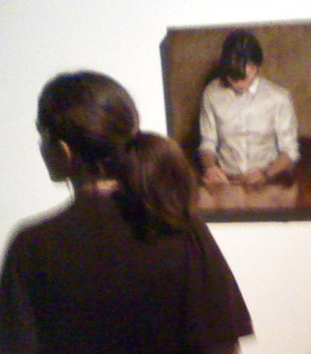
Museum of Contemporary Art Denver:
Another Victory Over the Sun
June 9, 2011 - August 21, 2011
 Victory
over the Sun
is the title of a 1913 Russian opera. Another Victory over the Sun is
the name of the summer exhibition at the Museum of Contemporary Art in
Denver.
Victory
over the Sun
is the title of a 1913 Russian opera. Another Victory over the Sun is
the name of the summer exhibition at the Museum of Contemporary Art in
Denver.
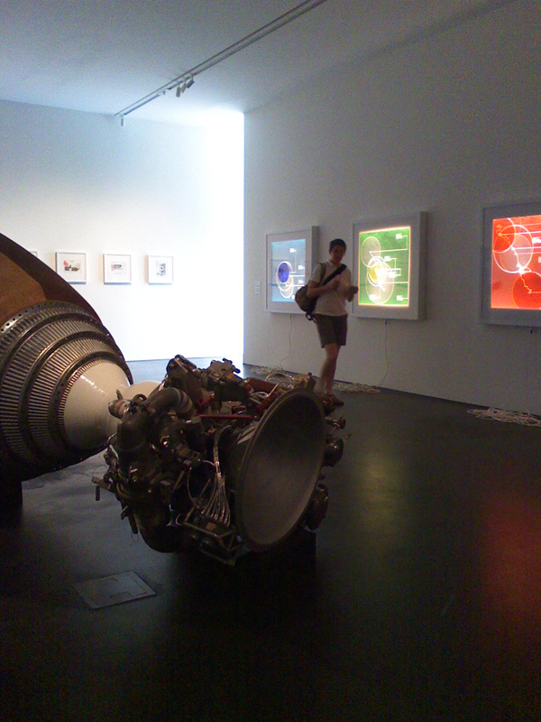
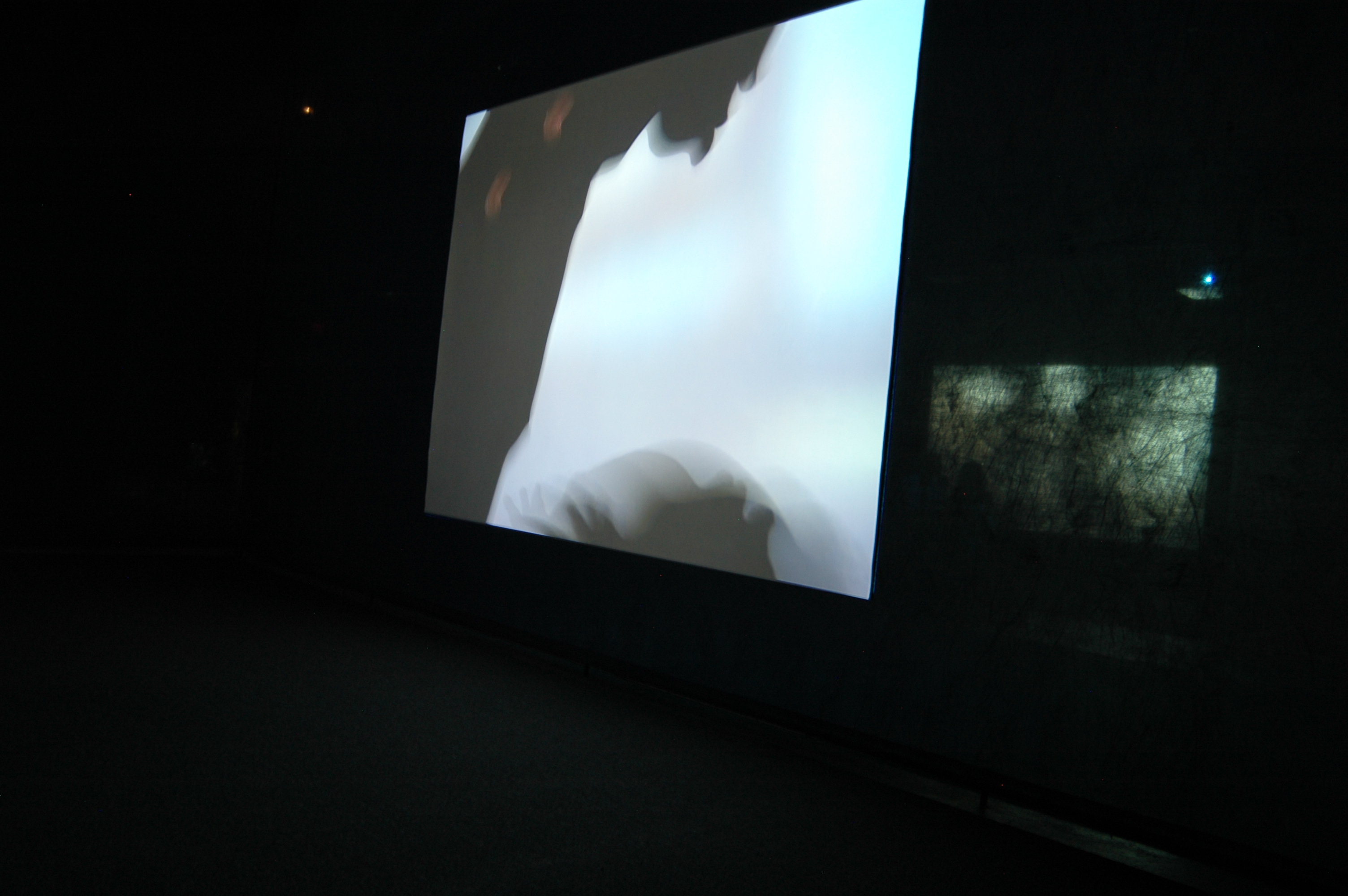
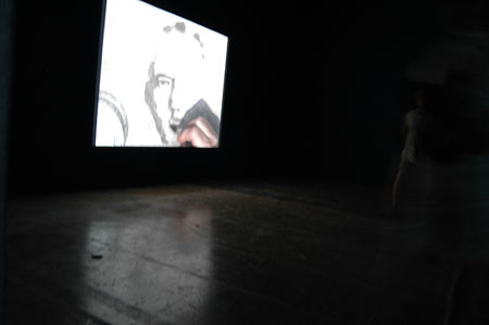
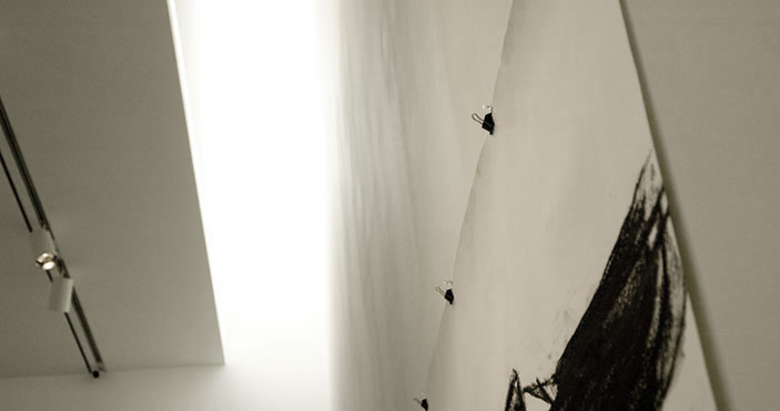
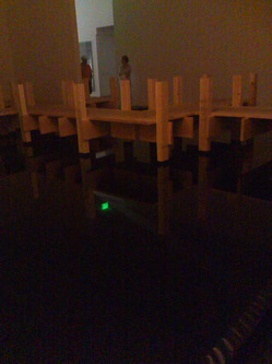
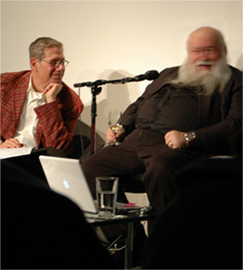
One work, the short video by Miguel Calderon, called Los Pasos del Enemigo, The Steps of the Enemy, I've seen several times. It was scary, wariness evoking every time, except one.
First, you have be aware there's no sunlight coming into the museum, so you can't really find the entrance to the video room. You can hear sounds of a wild cat before you find the entrance through the heavy black curtain into this gallery.
I fumbled around in the pretty-near-blackness and stand in pitch darkness. I don't know what's in this space with me. There's a burst of guttural roars - a big cat of some kind - and then you're surprised by the flash of yellow eyes and menacing teeth, and a sporadic variety of more growls.
On the day before the show opened, I heard that sound of tape ripping off a roll. They were finishing the work of blocking out all the sunlight. You've seen movies of people being duck taped. It's a scary sound in a dark room with a panther growling at you. The steps of the enemy ... when it's dark you can see those steps.
The next visit I was by myself, and realized I have very poor depth perception in the hearing sense. I knew what was going to happen but still I felt not so confident. The piece is very effective at letting us know our place is nature is very complicated.
Another time, I read the curatorial card that explains the piece and it refers to a Spanish expression: 'gato encerrado,' which literally means 'locked up cat'. I learn it is also the Spanish equivalent of: 'something's fishy' or 'I smell a rat.' And I start to think of how the video was made - probably at a zoo - with a locked up cat. I'm being scared, effectively, by a big cat in a cage. And my enemies, I'm not sure where they are. I am in the dark about them.
The only time I was not creeped out, scared, and off balance, I went into this gallery with a bunch of people, who all happened to be my family. We can bump into each other and its funny not scary. One laughs and someone makes a joke that we've probably heard before.
It made me realize why all those Ancestral Puebloans who used to live at Mesa Verde vanished - completely vanished from the Mesa - about the same time. They wanted to stick together.
If you'd like to read or hear more about this exhibition on UnsafeArt.com, please click on Personal Victory.
June 9, 2011 - August 21, 2011
Victory
over the Sun
is the title of a 1913 Russian opera. Another Victory over the Sun is
the name of the summer exhibition at the Museum of Contemporary Art in
Denver. One work, the short video by Miguel Calderon, called Los Pasos del Enemigo, The Steps of the Enemy, I've seen several times. It was scary, wariness evoking every time, except one.
First, you have be aware there's no sunlight coming into the museum, so you can't really find the entrance to the video room. You can hear sounds of a wild cat before you find the entrance through the heavy black curtain into this gallery.
I fumbled around in the pretty-near-blackness and stand in pitch darkness. I don't know what's in this space with me. There's a burst of guttural roars - a big cat of some kind - and then you're surprised by the flash of yellow eyes and menacing teeth, and a sporadic variety of more growls.
On the day before the show opened, I heard that sound of tape ripping off a roll. They were finishing the work of blocking out all the sunlight. You've seen movies of people being duck taped. It's a scary sound in a dark room with a panther growling at you. The steps of the enemy ... when it's dark you can see those steps.
The next visit I was by myself, and realized I have very poor depth perception in the hearing sense. I knew what was going to happen but still I felt not so confident. The piece is very effective at letting us know our place is nature is very complicated.
Another time, I read the curatorial card that explains the piece and it refers to a Spanish expression: 'gato encerrado,' which literally means 'locked up cat'. I learn it is also the Spanish equivalent of: 'something's fishy' or 'I smell a rat.' And I start to think of how the video was made - probably at a zoo - with a locked up cat. I'm being scared, effectively, by a big cat in a cage. And my enemies, I'm not sure where they are. I am in the dark about them.
The only time I was not creeped out, scared, and off balance, I went into this gallery with a bunch of people, who all happened to be my family. We can bump into each other and its funny not scary. One laughs and someone makes a joke that we've probably heard before.
It made me realize why all those Ancestral Puebloans who used to live at Mesa Verde vanished - completely vanished from the Mesa - about the same time. They wanted to stick together.
If you'd like to read or hear more about this exhibition on UnsafeArt.com, please click on Personal Victory.
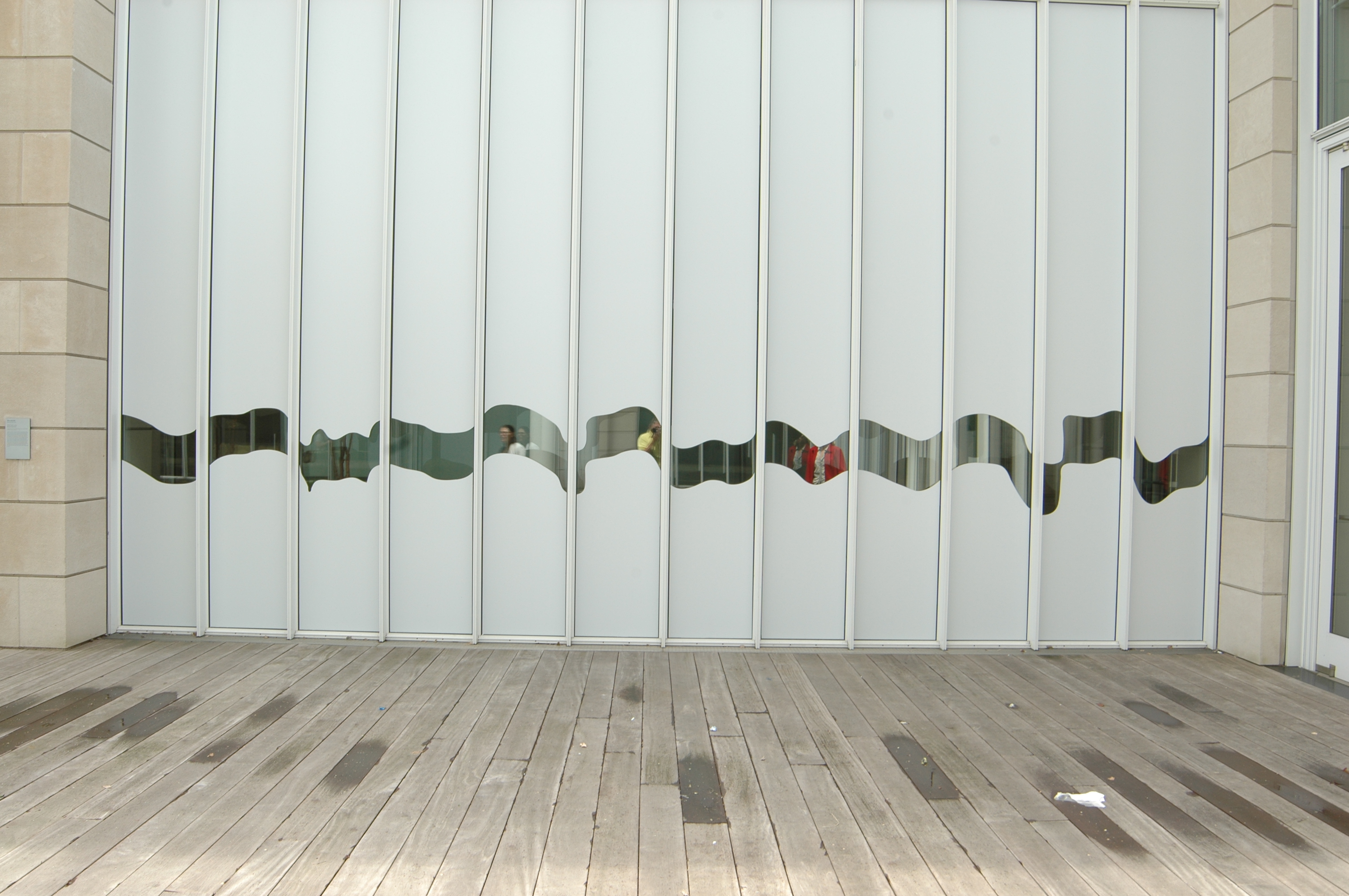
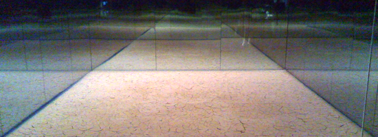 Learning to step into the shade was my first victory over the sun. Is this show about how man's ingenuity can beat nature's unpleasantness? Or do we need to know the art history themes attributed to the first Victory Over the Sun to get this show?

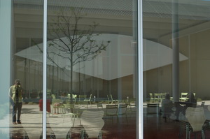
 My goal is to pass beyond the guy at the podium and start my trip to England and beyond. 'What's the purpose of your trip?' the guy asks holding my passport. To see art, of course. Instead, I say 'visit family.' I want to slip in, look ordinary like my passport photo on its neutral background.
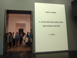
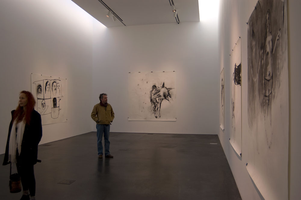
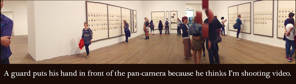
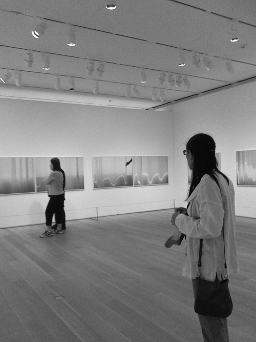
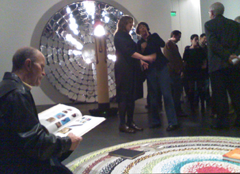
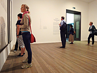 Look at the people in this exhibition. They're myopically reading the walls. Or standing in the center talking. One of our group suggests that Simon make it easier to read the narrative, and give us the time and space to read it - publish a book. Good idea, but her current audience is, right now, wandering through the Tate Modern. And, it's a big crowd, a less-than-mainstream crowd: people willing and able to look at contemporary visual art. Give us the visuals.


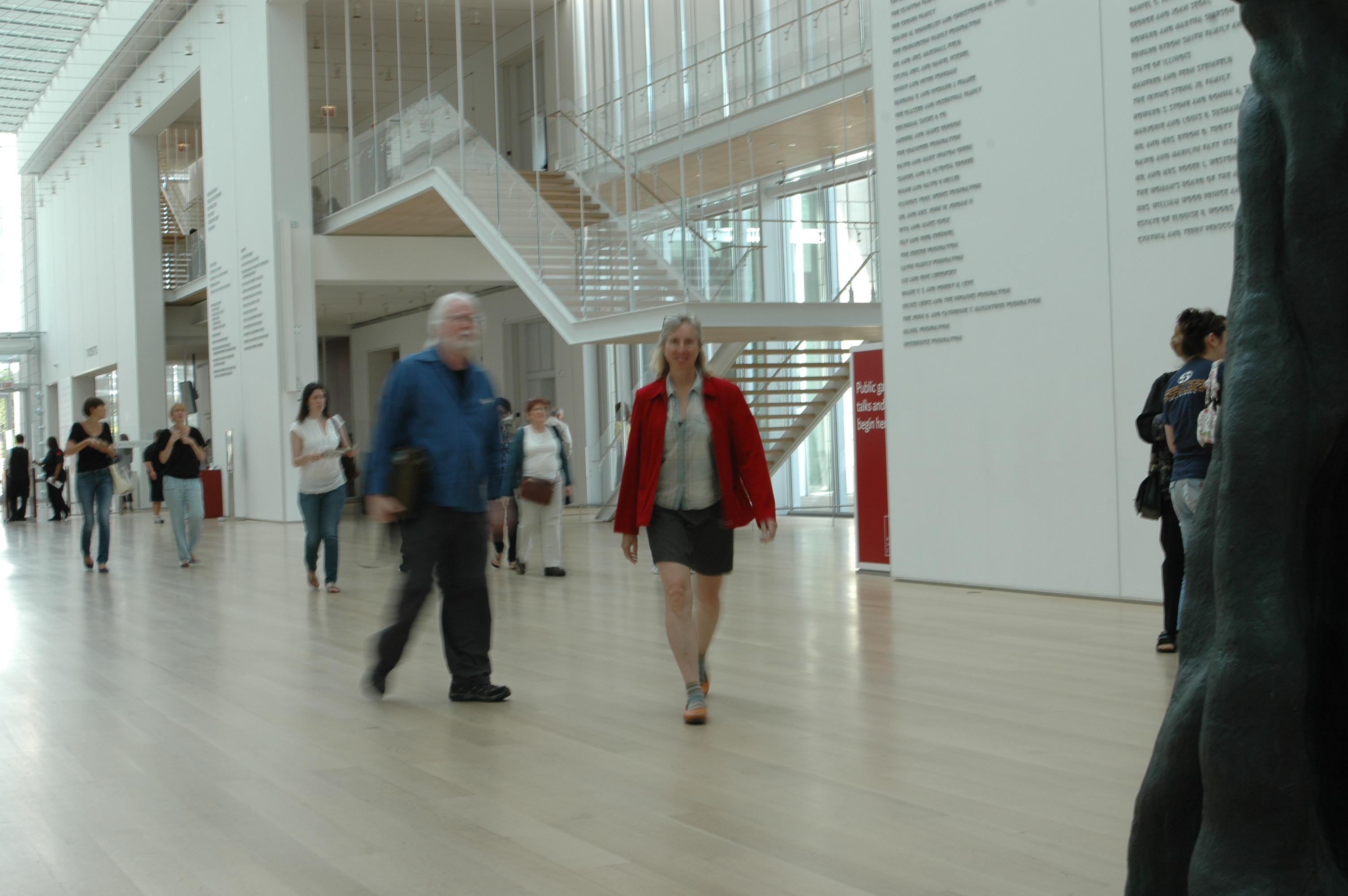

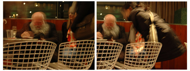
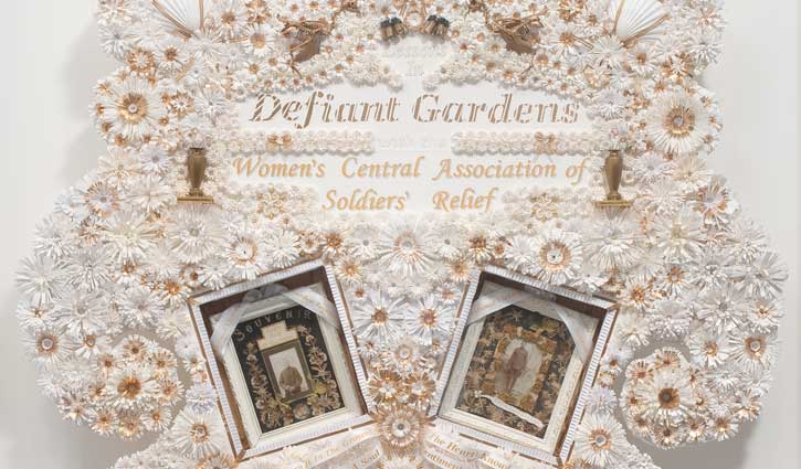
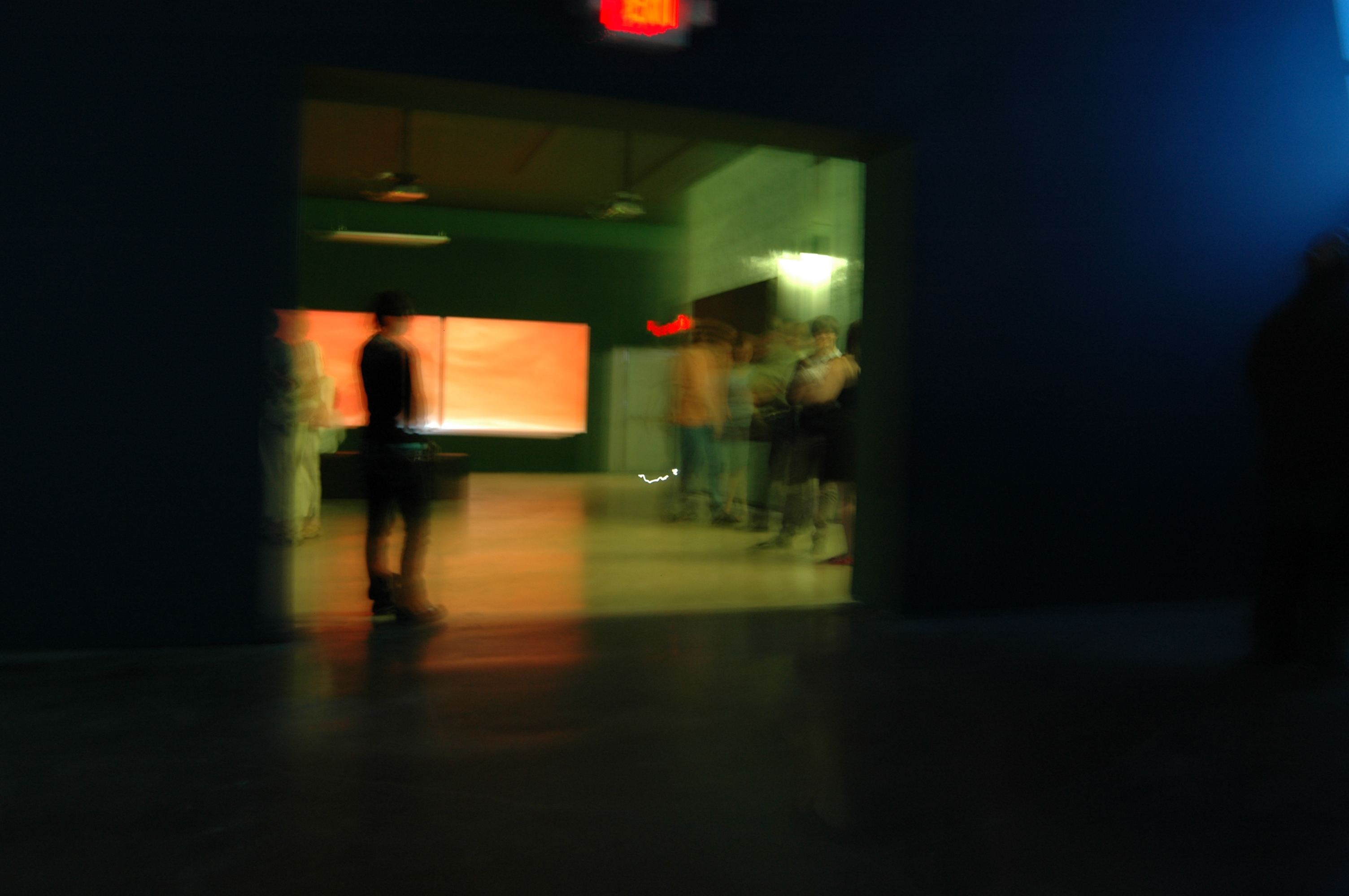
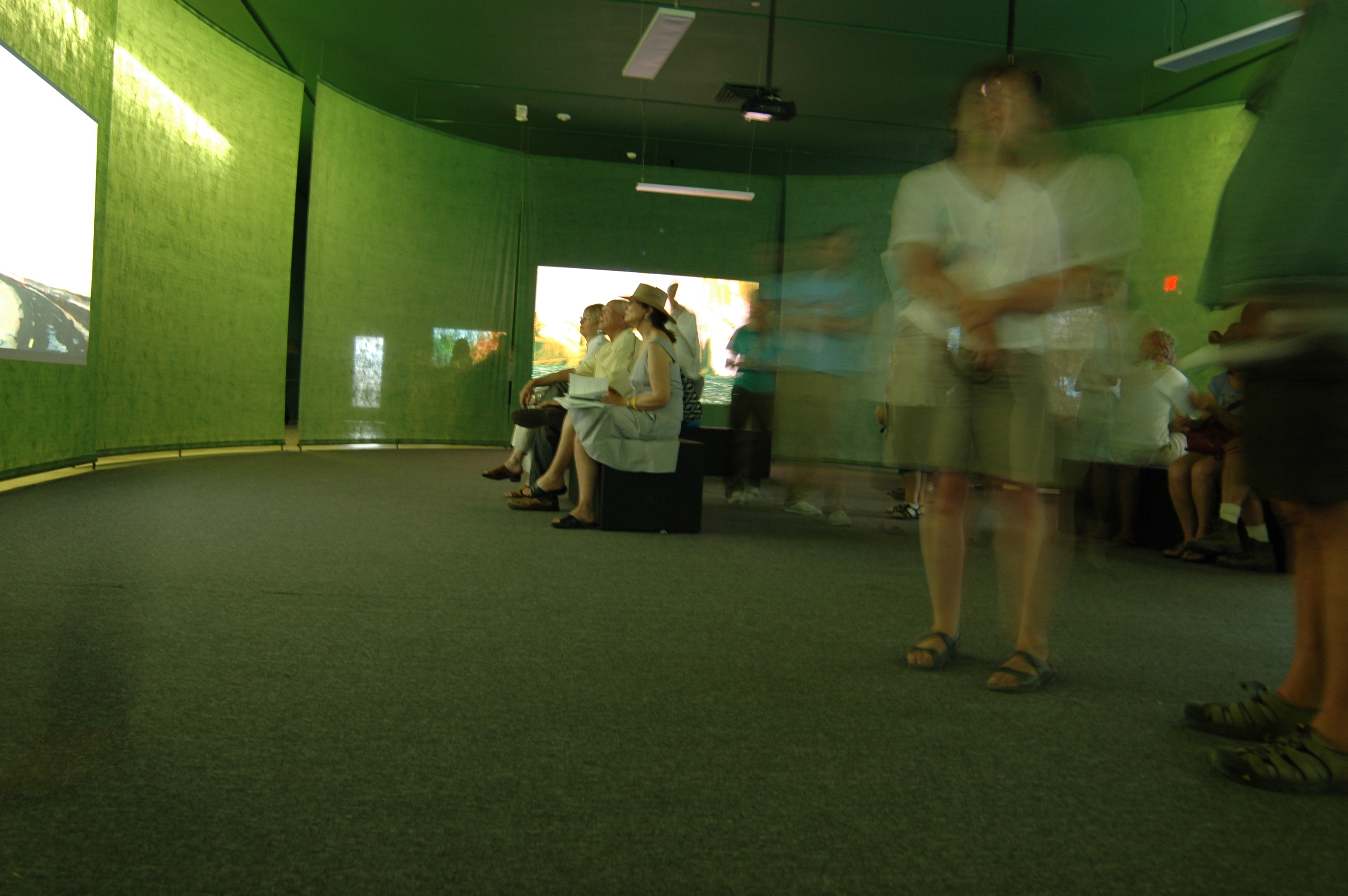
 Anyway last night, I'm worrying about worldly things and I'm at an opening at the Denver Museum of Contemporary Art. Tons of people mill around me to see the three new shows. In retrospect, I can name the three by the method of getting in your face: Bones, Blood and War.
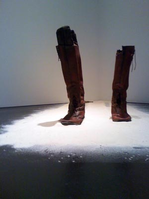 I step back over the dinosaur and human dust. I do think, at that moment, about how my body might decompose and rejoin the earth after I'm dead. I've never been a fan of a niche in a cemetery. I want my dust to be spread on the garden just like my grandfather-in-law was added to his bean trench. I mentally follow my future remains through the ground, into Denver sewer system, down the Platte into the Gulf of Mexico, possibly reincorporated into fly, then fowl, into New Orleans chef. I feel disappointed, however, because these ideas were not new ones to me. I'd already used them for a short story.
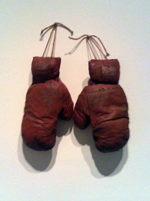
  In another corner, a pair of boots is standing in a pile of dust. Human bone dust, I guess. Inside each boot is a wooden leg. Carved by soldiers - amputees - my friend says - from the Civil War. I couldn't get close enough to the wall to read the card.